


How to Style the Perfect Outfit (Part II)
A Guide to Matching Colors

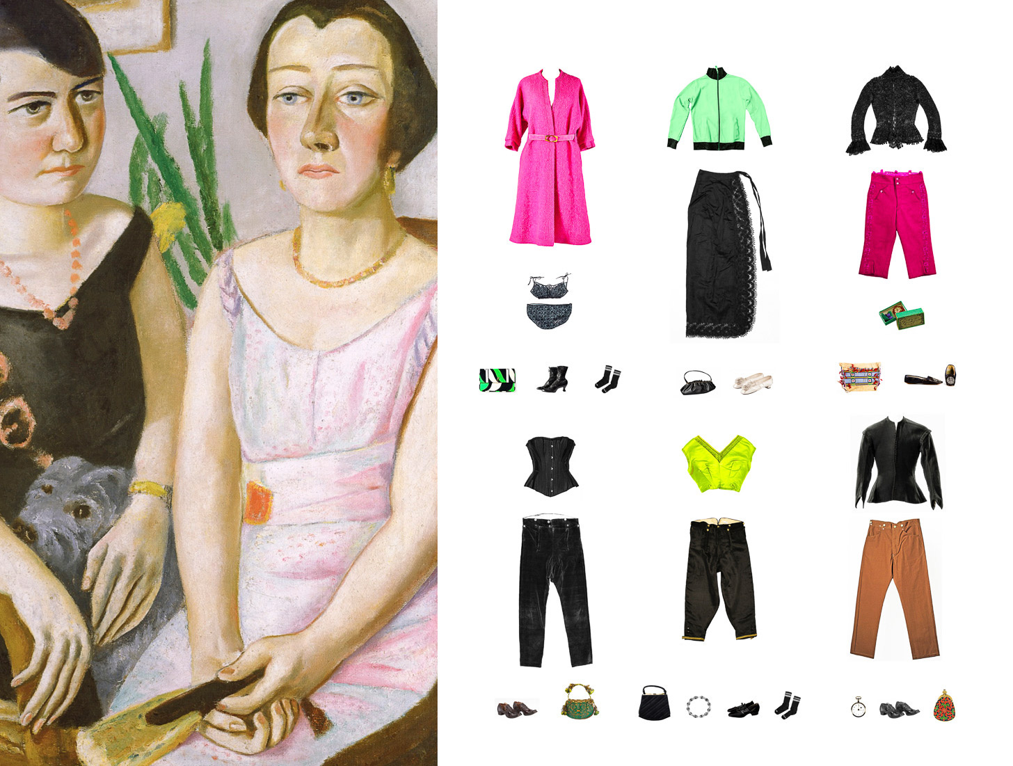
Previously, I discussed the economic advantages and the unparalleled practicality of wearing black tops, coats, and jackets. This simple advice obeys the laws of aerial perspective (when the near distance is rendered in warmer darker colors and the far distance in cooler paler colors). Additionally, I outlined the advantages of dressing monochromatically. However, when not enshrouded in black, I pair my black leggings with brightly colored tops that radiate a remarkable incandescence. The subversive fashion designer Rick Owens often pairs the color black with “jubilantly loud colors.” Desirable bright colors evoke strong, passionate emotions. Examples of such colors can be found in the bright colorations of toxic poison dart frogs.
I prefer colors are true to their essential nature. Muddy colors such as dusty rose and sage green are not attractive. Sage green is a diluted tone of an otherwise truly magnificent color rich in symbolic meaning. Green signifies the triumph of spring over winter and life over death. It also symbolizes charity, the nourishment of the psyche through good works, and, of course, water. Watering down this refreshing, compassionate color dilutes and weakens its emotionally charged impact.
True Neutral & Near Neutral Colors
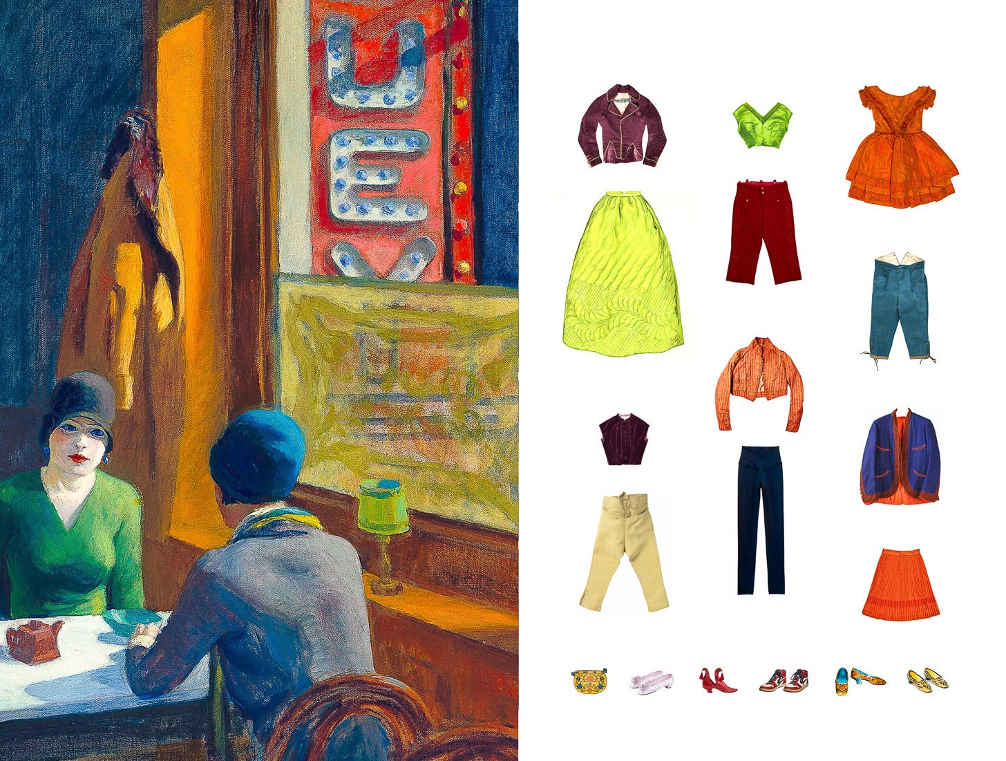
By definition, black, white, and gray are true neutral colors. Brown and tan are near neutral colors. Brown is my favorite near neutral color. Reminiscent of autumn’s unclothed branches and dead leaves, it signifies melancholy. Brown’s solemnity and humble nature adds great reverence to any outfit. Franciscans friars wear brown homespun cloth to display their renunciation of the world. In Ireland, the color brown often stands in for black and shares its underworld and warlike association. Brown looks fabulous when paired with black. A black top pairs perfectly with a pair of khaki pants. This combination has a pleasant degree of both visual and referential contrast (i.e. light vs. dark, mysterious vs. buttoned-up conservatism).
Grey
The true neutral color grey looks best when worn monochromatically. Walking through an atmospheric mist of grayness envelops you in a momentary shroud, a manifestation of the mysterious unknown. Grey nimbostratus clouds blanket the sky producing rain, snow, or sleet. Even when dressing down, grey sweatpants should be worn with grey sweatshirts. A grey suit accessorized with a white shirt is top notch. Never underestimate the reserved and contemplative nature of the color grey.
White
The color white signifies either the absence of color or the sum of all the colors. Wassily Kandinsky (1866-1944), a nonobjective painter, believes that white acts upon our psyche in a manner similar to experiencing perfect silence. That perfect silence is not lifeless but rather one energized by its inherent potentiality. He continues that if the color white was a sound, it would be the silence effused by the cold earth in the Ice Age. White was the color of mourning at the courts of the kings of France. The Aztecs associated white with the afterlife. However, white is most often associated with purity and innocence.
Waiter! Never wear a pair of black pants, shorts or skirts with a white shirt. Coordinating separates in such a fashion violates the aforementioned artistic practice known as aerial perspective. White tops should function as an accessory and not as a stand alone item of clothing. Black accessories add extreme drama to an all white outfit and vice versa. Donning black clothing trimmed with white is the ultra feminine version of wearing all black.
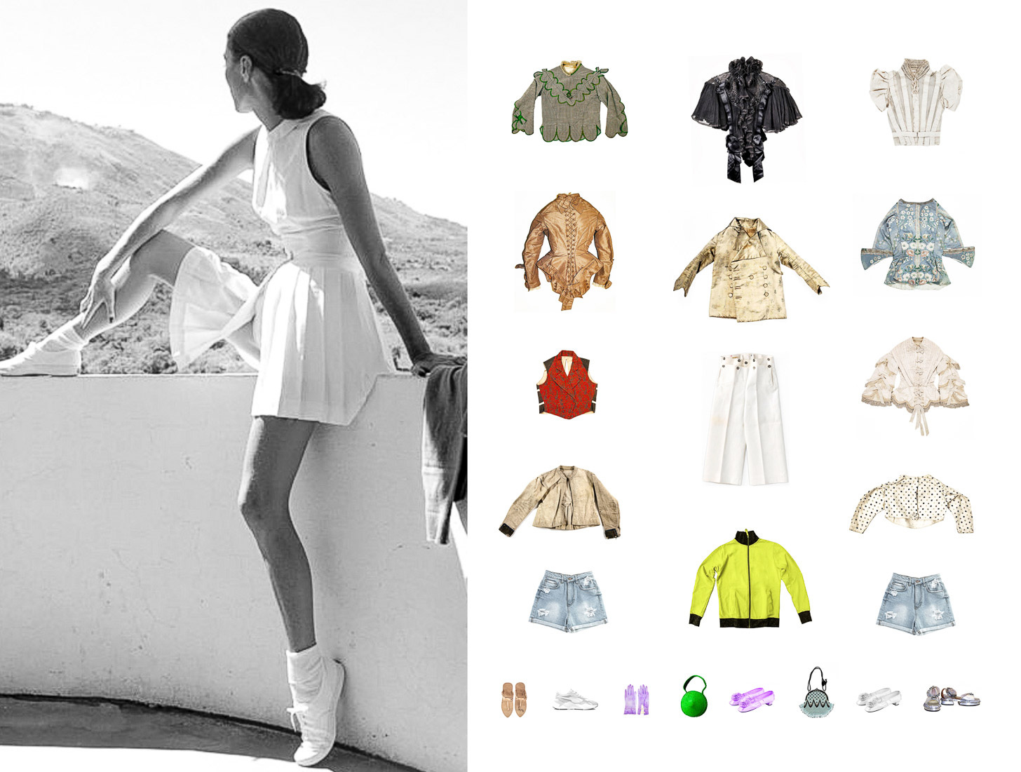
There are two exceptions: First, a well tailored white blazer looks sharp when worn with a handsome all black ensemble. Second, pairing white tops with light wash denim jeans is suitable because the two colors are in perfect tonal harmony. An all white outfit is the perfect summertime ensemble. To avoid looking like a nurse when dressed all in white, make sure to select the right accessories. White pants and skirts look splendid when worn with colorful jackets and tops. Black panty hose is elegant and attractive when worn with an all white ensemble.
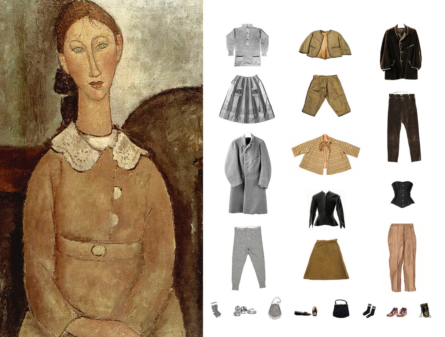
Earth Tones
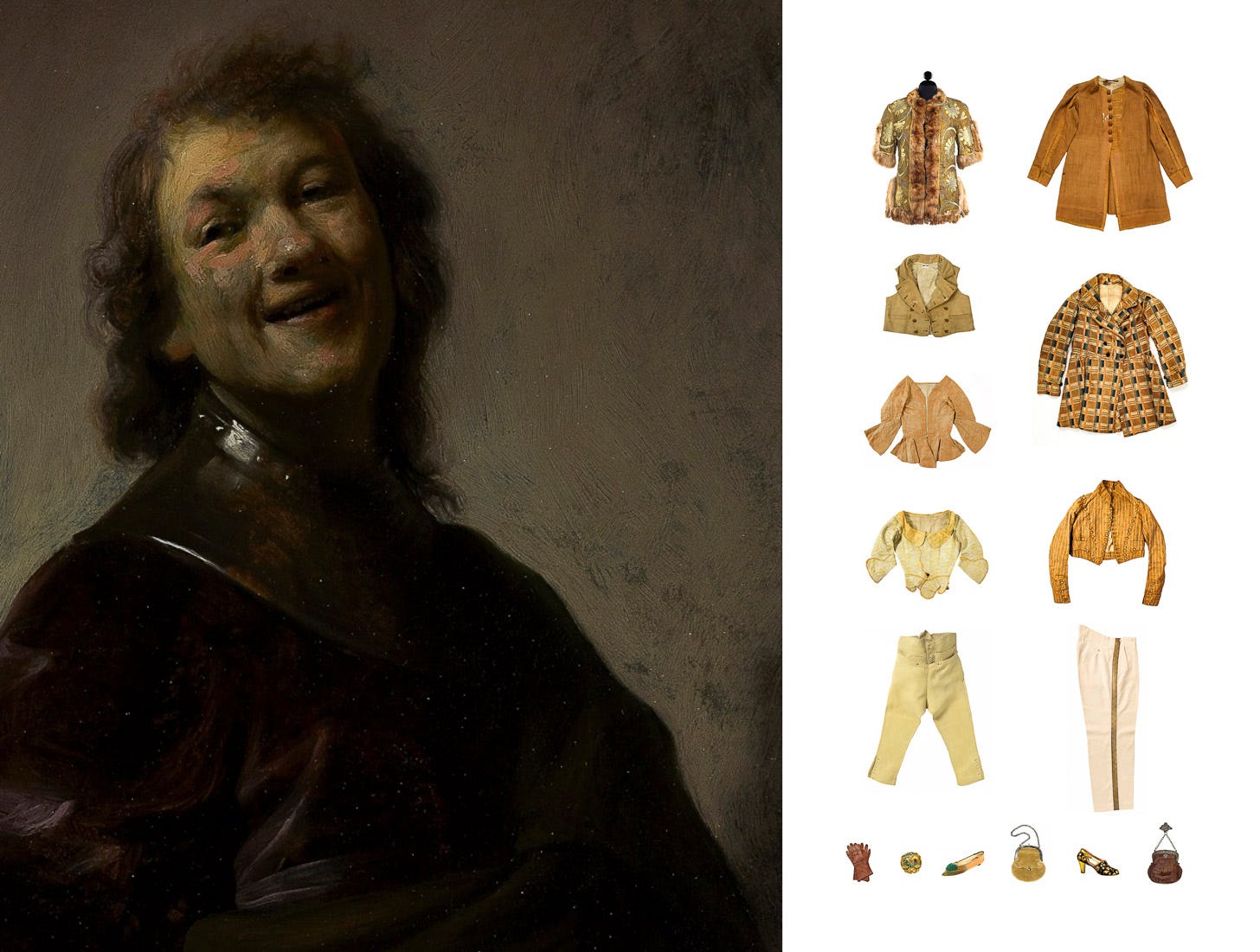
Earth tones are colors such as umber, ochre, and sienna. I greatly appreciate the paintings of Rembrandt (1606-1669) and Diego Velazquez (1599-1660). However, I do not share their preference for earth tones. On certain days, in certain moods, I find earth tones a tad somber.
Rembrandt’s proclivity for natural, earth tones emotionally charges his work with great intensity. A sensitive and skillful portraitist, Rembrandt captured an individual’s personality and psyche and, in the process, revealed much about the human condition. His mastery of portrait lighting has no equal. Rembrandt realized that each individual emanates their own inner light. This realization lead to his explorations of the psychology of lighting. He discerned the need for a personalized lighting scenario to capture the aura and unique beauty of his sitters. He accomplished this by manipulating the direction, intensity, and placement of the light source. This technique allowed the mood and character of the subject to shine through. Light and shadow often became one which results in a superb modulation that enhances the meditative, serene quality of Rembrandt’s entire oeuvre.
In his early work, the ground on Velazquez’s canvases was often literally a dull brown clay (no doubt more muddy due to the passage of time). The clay was pulverized into a powder for use as a preparatory layer. Velazquez painted the Water Carrier of Seville when he was only about 20 years old. This genre scene illustrates Velazquez’s command of his craft and his attention to detail. Giving intense credibility to the scene, he rendered the figures in this masterpiece with great admiration and respect. Velazquez intended this work to signify so much more than just a scene from everyday life.
A wardrobe that revolves around Rembrandt’s and Velazquez’s earth tones requires high maintenance. These autumnal colors look season specific and are not practical for year-round wear. Separates in earth tones look best in costly sumptuous fabrics. Inexpensive clothes purchased in earth tones look shabby fast. Their insipid nature makes them look like tattered rags before their time is up.
Complementary and Contrasting Colors
Art always influences my color preferences. Colors that possess distinct personalities are my favorite because they add a wow factor to any ensemble. Wearing complementary colors conjures up a mystical aroma of the sublime. Alberti (1404-1472) notes that there is a “friendship” between colors. When colors complement each other, it adds grace and dignity to their friendship. In the traditional RYB color model, when the complementary color combinations (red and green, yellow and purple, or orange and blue) are paired together, they amplify each other and generate the strongest level of contrast permissible. We can thank Eugene Delacroix (1798-1863)--the supreme colorist of modern times--for furthering our appreciation of the extraordinary optical effects formed by the use of complementary colors. Delacroix’s use of color became an essential component of Impressionistic and Post-Impressionistic practices. Van Gogh (1853-1890) was familiar with Delacroix’s psychology of colors. He used complementary colors to suggest emotion. The sight of a mustard yellow corn field set against a bright blue sky stirred Van Gogh’s psyche. He desired to express the distressing passions of humankind by means of red and green. Outfits comprised of contrasting colors have a magical transcendence and the aesthetic perfection that often originates in nature. Wearing colors that vibrate with an ethereal excitement elicits a great sense of happiness.
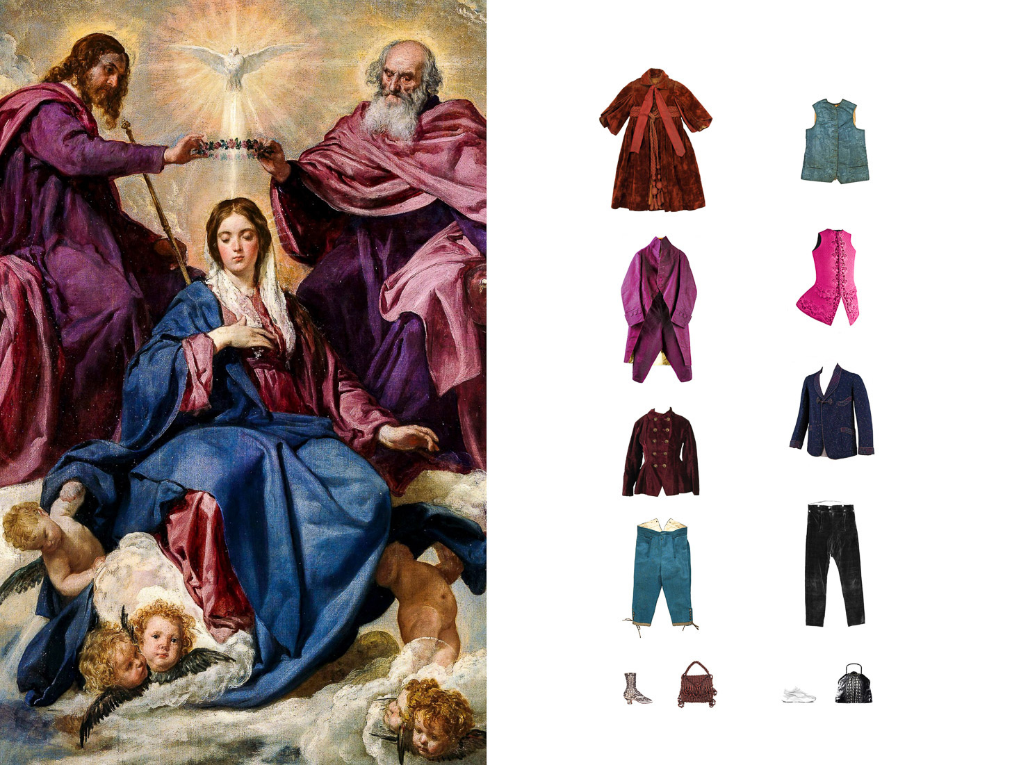
Matching hues in close proximity on the color wheel also achieves a harmonious appearance. Coordinating colors in such a fashion mimics the supremacy of monochromaticity. The color red looks superb when paired with its analogous colors, orange and magenta. A multitude of maroons and purples look best when paired with their neighbor, blue. Maroon and certain shades of purple do not coordinate well with the color black. They are simply too simpatico; no sparks fly in their relationship. Further, the resulting level of contrast is a visual bore.
Violet and Pink
In Concerning the Spiritual in Art, Kandinsky considers the language of form and the psychology of color. He notes the psychic effects of color produce spiritual vibrations and physical sensations. I agree with Kandinsky that in the physical and spiritual sense, violet is a red that has lost its ambient radiance creating an ailing sadness. In the Christian faith, purple symbolizes sorrow and penitence. In the world of grown-ups, a dark referential cloud hangs over certain shades of violet invoking “Twilight Sparkle.” Unless the decor of your bedroom is "My Pretty Princess," wearing pink and purple together is untenable.
There is nothing more luscious than a pair of pink pants or a skirt worn with a black top. The seductive nature of this color combination makes it age appropriate. According to public opinion surveys in Europe and the United States, the color pink symbolizes charm, politeness, childhood, the feminine, and the romantic. Few respondents choose it as their favorite color. Perhaps that has changed in light of the success of the recent “Barbie” movie.
Blue
The unexpected, raunchy combo of navy blue and black works so well together they can change places in an ensemble. For whatever reason, the color blue has never been on my fashion radar. An unidentifiable force holds me back from wearing this reductive, insubstantial color, viewable as a translucency in the natural world. Blue is a cold color, the color of truth, and a scented color infused with the divine. Kandinsky believes that although light blue is a heavenly color, an almost black "dark blue" relates an inconsolable grief that is beyond human comprehension. Chartres Cathedral’s stained glass windows bathe its interior in a bright shade of heavenly blue that creates a relaxing, soothing escape from this world. Pierre Puvis de Chavannes employed a multitude of light blues to create idyllic settings that renounce the din of realism. His ornamental virtual still life paintings are at once calming and reflective. Light blue is the color of meditation, and as it deepens naturally, it transforms into the color of dreams. With his use of a multitude of blues, the symbolist painter Odilon Redon awakens the inexplicable reality beyond appearance and gives life to the improbable. Redon’s majestic use of deep blue is “the stuff dreams are made of." Canaletto’s Venice: The Grand Canal with S. Simeone Piccolo features a beautiful, translucent blue that incidentally pairs well with the color black. He used Prussian blue--a new synthetic pigment made by chance in Berlin in the early 18th century--to achieve this truly heavenly hue. Despite all this loveliness, I have not yet warmed to blue. Kandinsky muses that shades of color, like sound, rouse emotions in the psyche too intricate to articulate.
Choose colors that will grace your wardrobe with an abundance of possibilities and permit you to dress in an up-to-date fashion that reflects the spirit of the times. Allow colors to express the essential elements of your personality with a charming authenticity that rings true. Shy away from the unfortunate advice that certain colors don’t suit you. Go for the gold and wear colors that match your mood, persona, and psyche.